Jade Monger. Courtesy photo. CLEARLAKE, Calif. — The Clearlake Police Department is asking for the community’s assistance in locating a missing teenager.
Police are trying to find 17-year-old Jade Monger.
Monger is described as a white female juvenile, with short curly blonde, blue and red hair and brown eyes.
She stands 5 feet 6 inches tall and is 200 pounds.
Monger was last seen in Clearlake, at which point she was wearing a black shirt with skulls on it, light blue shorts and white vans.
If you have any information regarding her whereabouts, please contact the Clearlake Police Department at 707-994-8251, Extension 1.
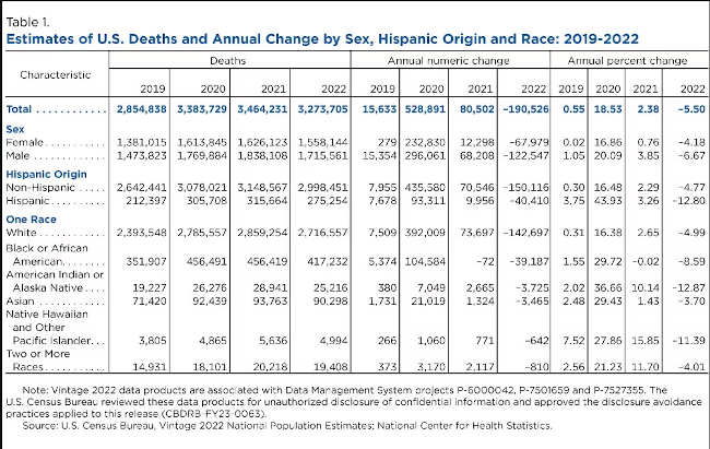
Males and the Hispanic, American Indian and Alaska Native (AIAN) populations experienced a disproportionately large number of deaths from 2019 to 2020, the year that includes the start of the COVID-19 pandemic.
Deaths for the total U.S. population increased 19% in 2020, but some groups were more affected than others, according to the U.S. Census Bureau’s Vintage 2022 Population Estimates released today — the first to contain final 2020 mortality data by demographic characteristics.
Increases in deaths during 2020 were reflected in previous estimates releases, but the latest data show the disproportionate impact of the pandemic on mortality by race/ethnicity and sex.
How we measure deaths
The U.S. Census Bureau’s annual estimates are based on final 2020 data and provisional totals from the National Center for Health Statistics, or NCHS.
To capture more recent trends in deaths during the entire estimates series (April 1, 2020-July 1, 2022), including those from the pandemic, we relied on newly available 2021 final data and 2022 provisional data from NCHS.
These data are subject to revision. The patterns described here, specifically for 2022, may differ slightly from those included in our next vintage estimates (Vintage 2023) which will be updated with final data.
Mortality trends by characteristics
There were large increases in deaths across all demographic groups between 2019 and 2020, and smaller increases for most groups from 2020 to 2021 (Table 1). Deaths declined for all groups from 2021 to 2022.
Mortality by sex
Males have historically had higher deaths than females and for most of the last decade, the gap between the two sexes had been growing prior to the pandemic (Figure 1). In 2012, for example, 50.1% of deaths were male. By 2019, the share had increased to 51.6%.
Between 2019 and 2020, male deaths increased by 296,061 (20.1%) and female deaths by 232,830 (16.9%). The trend continued in 2021, with 68,208 (3.9%) more male deaths and 12,298 (0.8%) more female deaths.
In 2021, 53.1% of those who died were male. Provisional 2022 NCHS data show larger declines for males but the share of male deaths (52.4%) was still larger than in pre-pandemic years.
The growing difference in deaths between males and females in 2020 and 2021 suggests the COVID-19 pandemic had a larger impact on the mortality of males than it did on females.
Hispanic origin
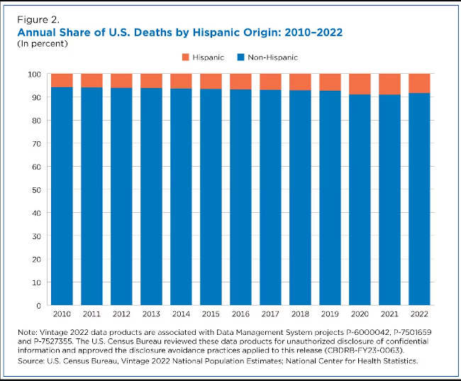
Because the Hispanic population comprises a much smaller share of the total population relative to the non-Hispanic group, the majority of deaths are non-Hispanic (Figure 2).
Similarly, as the share of the Hispanic population increased from 2010 to 2020, so did the share of deaths among this group, which went from 6.2% in 2012 to 7.0% in 2017 and 7.4% in 2019.
The increase in Hispanic deaths between 2019 and 2020, however, represents a notable break in the time series, jumping from 7.4% to 9.0% of all deaths in a single year. The Hispanic population’s share of mortality increased again (9.1%) in 2021, the first full year of the pandemic.
The increase in Hispanic mortality during the pandemic was higher relative to the non-Hispanic U.S. population, though it declined slightly to 8.4% of total deaths in 2022, according to provisional data.
Race groups
All race groups had higher-than-normal increases in deaths from 2019 to 2020 (Figure 3). But during the pandemic’s first year, every race group other than the White population experienced single-year percentage increases higher than the 18.5% increase in deaths for the total population.
Prior to the pandemic, mortality increases in the previous decade were relatively small and did not vary as much annually across races (Figure 3).
Figure 3 highlights the following trends in mortality rates:
• In 2020, the largest mortality increase occurred in the American Indian and Alaska Native population (36.7%), followed by the Black (29.7%) and Asian (29.4%) populations. • In 2021, there was more variation in the magnitude and direction of change across groups. Black deaths decreased by less than 1% between 2020 and 2021, while the Native Hawaiian and Other Pacific Islander (15.9%), Two or More Races (11.7%), and American Indian and Alaska Native (10.1%) populations continued to experience larger percentage increases in deaths than the total population. • White deaths (2.65%) were also slightly higher than the total increase (2.38%). • Provisional 2022 data show declines in mortality for all race groups between 2021 and 2022, with the largest declines occurring among the American Indian and Alaska Native (-12.9%) and Native Hawaiian and Other Pacific Islander (-11.4%) populations.
Pandemic’s impact on national deaths
The data released offer the most comprehensive look at the impact of COVID-19 mortality in the Census Bureau’s annual population estimates series to date.
Final 2020 data allowed us to account for mortality differences across race groups during the early years of the pandemic. As more final data become available, we will continue to revise the estimates and improve our understanding of how the pandemic affected the nation’s population.
Of particular interest is whether the declines in deaths for 2022 shown in provisional data will result in a return to pre-pandemic levels for mortality, similar to what we are observing for international and domestic migration.
Shannon Sabo is a statistician/demographer in the Census Bureau’s Population Division. Sandra Johnson is chief of the Population Division’s Population Evaluation, Analysis, and Projections Branch.
Patrick Rooney, Indiana University; Anna Pruitt, Indiana University, and Jon Bergdoll, Indiana University
For only the fourth time on record, Americans gave less than they did the previous year without accounting for inflation, according to the newest annual Giving USA report. The research, released by the Giving USA Foundation, in partnership with the Indiana University Lilly Family School of Philanthropy, found that total giving fell 10.5% in inflation-adjusted terms, the steepest decline since the Great Recession of 2007-2009. Giving in nominal dollars, without that adjustment, dropped by 3.4%.
Giving declined across the board with lower levels of donations from individuals, foundations, the estates of deceased donors, and corporations – when accounting for inflation.
Giving in 2021 was even stronger than we first estimated, reaching $517 billion that year, surpassing half a trillion dollars for the first time. This revision was based primarily on updates that the U.S. government makes to tax data – an annual practice.
The large total amount that Americans gave to charity in 2021, which followed another strong year in 2020, helps to explain why giving declined so much in 2022. Donations fell in 2022 from unusually high levels reached when Americans responded to needs that arose due to the pandemic and calls for social justice.
Donors at all income levels likely scaled back
Individual donors, who comprise the largest share of giving, gave $319 billion in 2022 – 13.4% less than they did in the previous year after adjusting for inflation. Unlike in recent years, when market gains boosted the net worth of wealthy Americans, the stock market fell in 2022 by more than any year since 2008, reducing the net worth of many U.S. households.
Despite declines in the stock market, the job market in 2022 was strong – which can be a good sign for the financial stability of less affluent households. Employment levels rose, with the jobless rate dipping to about 3.5%.
Wages also grew in 2022; however, that growth did not keep up with inflation. Instead, many Americans were forced to use their savings to stay on top of their bills, as they paid more for food, housing and other expenses.
The Giving USA data shows that people give about 2% of their disposable personal income – the money available after they pay taxes – to charity. Because inflation-adjusted disposable personal income fell by more than 6% in 2022, Americans had less money to give away.
Americans had grown accustomed to far lower levels of inflation, which averaged a bit below 3% in the 40 years prior to 2022.
As a consequence, donors may not have taken into account the fact that annual gifts simply did not go as far in 2022 as they did in 2021. If you gave your local food pantry $100 in 2021 and then did the same in 2022, you might think that your giving didn’t change. But in a year of high inflation rates, that seemingly steady donation was actually a smaller gift in terms of what the food pantry could do with the money.
Foundations and corporations also gave less than they did the year before, and bequests from the estates of people who have died also declined after adjusting for inflation.
Similarly, giving to nearly all of the nine categories that Giving USA tracks fell in 2022 in inflation-adjusted dollars.
One of the two exceptions was gifts to foundations, which grew 1.9%. This small uptick was probably caused by one or two large gifts to new or existing foundations.
We also saw some promising signs. For example, giving for international causes grew by 2.7%, likely driven by support for Ukraine following Russia’s attack. This is in keeping with another pattern in the data: Americans give charitably as a way to address pressing issues. In the Great Recession, Americans increased giving to support basic social services, such as gifts to food banks, even when overall giving declined.
Finally, it is important to acknowledge that giving did remain close to record levels in 2022, at nearly $500 billion for the year. As the report observes, giving eventually bounces back from declines, even when adjusting for inflation.
Patrick Rooney, Glenn Family Chair Emeritus of Economics and Philanthropic Studies, Indiana University; Anna Pruitt, Associate Director of Research, Indiana University Lilly Family School of Philanthropy, and Managing Editor, Giving USA, Indiana University, and Jon Bergdoll, Associated Director of Data Partnerships at the Lilly Family School of Philanthropy, Indiana University
The waters of Clear Lake. Photo by Angela DePalma-Dow. Dear Lady of The Lake,
There is a weird smell coming from the lake at our lake house; it smells pretty bad. Is this something to be worried about? Was there a sewage spill?
Thanks,
From Worried about the Aroma, Eva.
Dear Eva,
Thank you for this question! I have actually gotten asked this several times recently. Anyone who has been outside anytime this week in the vicinity of the lake, might have also observed a specific odor associated with large, fresh waterbodies.
For a lake nerd, like me, I am not ashamed to say I love that smell. It means the lake is very alive and life is thriving. However, in some areas of the lake the smell can become very concentrated, and with a certain wind direction and temperature combination the smell can become singularly strong and sometimes noxious.
Lake signs of life and death
This time of year, when the sunlight days are long and the temperature is - finally! -warm, this is when growth in the lake is at its highest rates. This basically means that organisms from the smallest phytoplankton cell, to large clonal tule beds, to the largest catfish or river otter are growing the most this time of the year.
That’s because the conditions are the best for metabolic processes like photosynthesis and respiration, decompositions, nitrification, and denitrification. These are all very long words for saying that plants and animals, big and small, are happy, healthy and growing the most right now because it's easy for chemical processes to occur when it's warm. Also, the consumption and excretion processes are also in full force right now.
The smallest organisms in the lake, that mostly contribute to smells and odors, are green algae (phytoplankton) and blue-green algae (cyanobacteria). Cyanobacteria are not related to algaes at all, they are bacterias, but they look similar to our naked eye as green algae so historically they have been labeled an algae, and a blue-green algae for the colors they sometimes appear as.
Phytoplankton are simple microscopic organisms, like small plants. Cyanobacteria are aquatic bacteria, much smaller than phytoplankton, and they inhabit the same space as phytoplankton. Because both phytoplankton and cyanobacteria photosynthesize, they take in sunlight, carbon dioxide, and use nutrients from the lake as fuel, it’s easy to see why they are abundantly growing this time of year.
Cyanobacteria are usually single-cellular and can form colonies and dense mats at the surface of the water due to buoyant chambers some genera produce. The buoyancy characteristics of cyanobacteria means they can make themselves float at the surface of the water, usually in dense colonies, which can shade out the phytoplankton below them.
Sitting at the surface of the water, baking in the sun, can also cause death to some of the colony, causing a very strong odor in the near vicinity. After the cells die, they fall through the water column and break apart, releasing the nutrients they consumed as fuel, and neighboring cyanobacteria cells are now able to utilize those nutrients, grow, reproduce, and float to the surface of the water to conduct the whole cycle again.
This cycle of cyanobacteria, growing, reproducing, dying, and recycling for new cyanobacteria, is the most probable cause of the strongest odors coming from the lake right now and going into the end of summer and early fall.
Other sources of lake smells can be the decay of aquatic plants that have washed up along the shore and are rotting in the sun. Aquatic plants can also get tangled up with insects and baby fish, so those organic tissues can add to the decay and odors along the shorelines or in shallow, very warm areas of the lake.
Green algae that can also boom and busts cycles within the lake, with excess growth and decay giving off similar odors as dead plants. If you would like to learn more about green algae, or phytoplankton, you can visit the the County of Lake Water Resources Department “Algae in Clear Lake” webpage.
If you want more information on cyanobacteria, beyond that related to smells, you can visit my previous Lady of the Lake column from July 11, 2021, “Concerned about Cyanobacteria in Soda Bay."
What about spills,blooms, sheens, and foams
The likelihood of this smell being sourced to a sewage spill is very small, as sewage spills into the lake actually don’t have much of a strong smell because of the dilution of the lake water, and there is quite a bit of lake water (46,000 acres in fact!).
Secondly, there hasn’t been any reported spills the last few weeks at all, and for years there have not been any spills directly into the lake that were large enough to cause a persistent smell like you described.
You can learn about, search for, and find any reported hazardous spills at the CalOES Hazardous Spill Reporting Database. You can do a filtered search by county, and year, or a specific date.
Sometimes smells are accompanied by blooms, mats, sheens, or foams. Blooms can look like bright green, blue, purple, even reddish water, and mats can look like thick, almost solid, clumps, or layers on the surface of the water. Both blooms and mats can be attributed to specific genera of cyanobacteria.
Sometimes the water looks so opaque and blue green that people mistake it for paint spills. I actually responded to a report of spilled paint this year that turned out to be a cyanobacteria bloom – it’s not unusual and when you see it, it really does look like paint.
Sheens can appear when any natural decompositional process is occurring, such as the dying and decay of plants, animals, insects, or algae cells. Sheens are caused by oils that are released from the organisms during the decomposition process, and since oils are lighter in density than water, they will sit at the surface of the water and look much similar to an “oil spill” or “gasoline spill.”
Figure: Cyanobacteria bloom reported as spilled paint in a lake in Utah. Photo: Utah Department of Environmental Quality. Rotting vegetation can also produce methane gasses, especially when it sinks to the muddy bottom of a lake or wetland. Microbes break down the decaying vegetation, which metabolically takes all the oxygen out of the system, and methane is a byproduct.
Methane can mostly just evaporate into the atmosphere, but when its concentrated in a small area, usually in a shoreline zone, trapped among some tules, or in a pool where water has receded, the methane molecules collect together, and appear as thick or rainbow sheens on the surface of the water. The hydrocarbons that make this methane phenomena are very similar in structure to the hydrocarbons in petroleum gasoline and oils used for engines, so that is why they are often confused with spills or illegal discharges.
Methane can become especially smelly when it is mixed with naturally occurring hydrogen sulfide, especially in environments that have high sulfates, which can include Lake County because there is high ambient sulfur background in the surrounding geology. This can mimic the smell of rotten eggs, and can be very obtrusive to some with acute senses of smell.
Foams that accompany smells, or discolored water, are completely natural, although they get mistaken for pollution or discharge events. Foam is very natural for lakes and streams, and happens when there is an abundance of organic (i.e. carbon-based) materials in the water, which can break down surface tension of water making bubbles form. Physical lake processes, like wind or wave action, can concentrate bubbles into thick foams in a single area, or even a line parallel to a shoreline.
Sometimes the foams get mistaken for a “detergent spill” but detergents don’t last as long as natural foams since their sudsing agents are very short lived, and usually detergents have a pleasant, floral or perfume fragrance to them, which does not really correspond with reports of algae and lake smells.
Sometimes the foams occur out in the open water, and in combination with organismal processes, the lake appears to have lines or rows of green or brown or white foamy streaks. These are totally natural and way cool and called Langmuir Lines. You can learn all about these in my “Look, Look! It’s Langmuir Lines” column from March 2022.
Sometimes smells can arise from larger dead organisms, such as fish. Recent carp and goldfish die offs in the late, caused by a lab-determined koi herpes outbreak, is causing lots of large-bodies carp and goldfish to go belly-up and wash ashore near homes, parks, docks, and recreation areas on the lake.
Of course decaying tissue such as a fish would cause a particular strong odor, but will quickly dissipate naturally especially during windy and waving conditions. To speed up the process, should one be capable, a net and a trashcan will eliminate the odor completely. There is no public service that will collect and dispose of the dead carp in Clear Lake.
If you suspect there is a fish kill of a different species of fish, and in numbers that are unusual (more than a few) then you can report this to the California Department of Fish and Wildlife Mortality hotline, 916-358-2790, or submit a report to the online form.
I hope I answered your question Eva, and I wouldn’t worry about the aroma if I were you, it’s a sign that our lake is full of life.
However, if the smell becomes too strong, or noxious, and is impacting you, or someone in your family that has a history of respiratory problems, the State Of California Office of Environmental Health Hazard Assessment, or OEHHA, wants to know about it and has resources to respond. OEHHA can provide specialized guidance that is beyond the resources available at the local level.
To report a health impact from a bloom or cyanobacteria bloom, suspected bloom, from the lake, you can submit a report to OEHHA via the Harmful Algal Bloom Incident Reporting tool, called “Report a Bloom."
Or by calling their Report a Bloom hotline: 1-844-729-6466 (toll free).
It takes about a minute to fill it out, but it’s essential that the state receives this information so that they can respond and direct more adequate resources to cyanobacteria management and mitigation.
If you are interested in knowing where reports of blohttps://mywaterquality.ca.gov/habs/where/freshwater_events.htmloms are, so you can cross-reference with your location in help to identify a potential odor or condition in Clear Lake, or other lakes, you can visit the HAB Incident Reports Map.
In lakes, and other natural water bodies, like rivers, bogs, marshes, and wetlands, smells and odors are usually indicative of natural cycles of life and death. Aquatic ecosystems have a great way to effectively reusing and recycling materials, they just might get a little smelly along the way. Some odors can be pungent at times, but they are not permanent.
— Sincerely,
Lady of the Lake
Angela De Palma-Dow is a limnologist (limnology = study of fresh inland waters) who lives and works in Lake County. Born in Northern California, she has a Master of Science from Michigan State University. She is a Certified Lake Manager from the North American Lake Management Society, or NALMS, and she is the current president/chair of the California chapter of the Society for Freshwater Science. She can be reached at LadyoftheClearLake@gmail.com.
Visitors at Sliding Rock, a popular cascade in North Carolina’s Pisgah National Forest. Cecilio Ricardo, USFS/Flickr
Outdoor recreation is on track for another record-setting year. In 2022, U.S. national parks logged more than 300 million visits – and that means a lot more people on roads and trails.
For all of their popularity, national parks are just one subset of U.S. public lands. Across the nation, the federal government owns more than 640 million acres (2.6 million square kilometers) of land. Depending on each site’s mission, its uses may include logging, livestock grazing, mining, oil and gas production, wildlife habitat or recreation – often, several of these at once. In contrast, national parks exist solely to protect some of the most important places for public enjoyment.
In my work as a historian and researcher, I’ve explored the history of public land management and the role of national parks in shaping landscapes across the Americas. Many public lands are prime recreational territory and are also becoming increasingly crowded. Finding solutions requires visitors, gateway communities, state agencies and the outdoor industry to collaborate.
U.S. public lands are managed for many different purposes by an alphabet soup of federal agencies.
Alternatives to national parks
The U.S. government is our nation’s largest land manager by far. Federal property makes up 28% of surface land area across the 50 states. In Western states like Nevada, the federal footprint can be as large as 80% of the land. That’s largely because much of this land is arid, and lack of water makes farming difficult. Other areas that are mountainous or forested were not initially viewed as valuable when they came under U.S. ownership – but values have changed.
Public lands are more diverse than national parks. Some are scenic; others are just open space. They include all kinds of ecosystems, from forests to grasslands, coastlines, red rock canyons, deserts and ranges covered with sagebrush. They also include battlefields, rivers, trails and monuments. Many are remote, but others are near or within major metropolitan areas.
Many people who love hiking, fishing, backpacking or other outdoor activities know that national parks are crowded, and they often seek other places to enjoy nature, including public lands. That trend intensified during the COVID-19 pandemic, when lockdowns and social distancing protocols motivated people to get outside wherever they could.
The rise of remote work has also fueled a population shift toward smaller Western towns with access to open space and good internet access for videoconferencing. Popular remote work bases like Durango, Colorado, and Bend, Oregon, have become known as “Zoom towns” – a fresh take on the old boomtowns that brought people west in the 19th century.
With these new populations, gateway communities close to popular public lands face critical decisions. Outdoor recreation is a powerful economic engine: In 2021, it contributed an estimated US$454 billion to the nation’s economy – more than auto manufacturing and air transport combined.
But embracing recreational tourism can lead local communities into the amenity trap – the paradox of loving a place to death. Recreation economies that fail to manage growth, or that neglect investments in areas like housing and infrastructure, risk compromising the sense of place that draws visitors. But planning can proactively shape growth to maintain community character and quality of life.
Broadening recreation
People use public lands for many activities beyond a quiet hike in the woods. For instance, the Phoenix District of the federal Bureau of Land Management operates more than 3 million acres across central Arizona for at least 14 different recreational uses, including hiking, fishing, boating, target shooting, rock collecting and riding off-road vehicles.
Not all of these activities are compatible, and many have not traditionally been rigorously managed. For example, target shooters sometimes bring objects like old appliances or furniture to use as improvised targets, then leave behind an unsightly mess. In response, the Phoenix District has designated recreational shooting sites where it provides targets and warns against shooting at objects containing glass or hazardous materials, as well as cactuses.
Shooting at targets that contain glass or hazardous materials can contaminate nearby land.BLM
Skiing also can pose crowding challenges. Many downhill skiing facilities in the West operate on public land with permits from the managing agency – typically, the U.S. Forest Service.
One example, Bogus Basin Mountain Recreation Area is a nonprofit ski slope 16 miles from Boise, Idaho. Demand surges on winter weekends with fresh powder, creating long lift lines and crowded slopes.
The mountain is open for 12 hours a day, and Bogus Basin uses creative pricing structures for lift tickets to spread crowds out. For example, it draws younger skiers with discounted night skiing and retired skiers during the week. As a result, the parking lot only filled up once in the 2022-2023 season.
Local governments can help find ways to balance access with creative crowd management. In Seattle, King County launched Trailhead Direct to provide transit-to-trails services from Seattle to the Cascade Mountains. This approach expands access to the outdoors for city residents and reduces traffic on busy Interstate 90 and crowding in trailhead parking lots.
Other towns have partnered with federal land agencies to maintain trail systems, like the Ridge to Rivers network outside Boise and the River Reach trails near Farmington, New Mexico. This helps the towns provide better nearby outdoor opportunities for residents and attract new businesses whose employees value quality of life. Creating corridors from the “backyard to the backcountry,” as the Bureau of Land Management puts it, can help create vibrant communities.
A less-extractive view of public lands
For many years, Western communities have viewed public lands as places to mine, log and graze sheep and cattle. Tensions between states and the federal government over federal land policy often reflect state resentment over decisions made in Washington, D.C. about local resources.
Now, land managers are seeing a pivot. While federal control will never be welcome in some areas, Western communities increasingly view federal lands as amenities and anchors for immense opportunities, including recreation and economic growth. For example, Idaho is investing $100 million for maintenance and expanded access on state lands, mirroring federal efforts.
As environmental law scholar Robert Keiter has pointed out, the U.S. has a lot of laws governing activities like logging, mining and energy development on public lands, but there’s little legal guidance for recreation. Instead, agencies, courts and presidents are developing what Keiter calls “a common law of outdoor recreation,” bit by bit. By addressing crowding and the environmental impacts of recreation, I believe local communities can help the U.S. move toward better stewardship of our nation’s awe-inspiring public lands.
LAKE COUNTY, Calif. — Need a new friend? Lake County Animal Care and Control has a dog for you.
Dogs available for adoption this week include mixes of Anatolian shepherd, Catahoula leopard dog, German shepherd, husky, Labrador retriever, mastiff, pit bull, plott hound and terrier.
Dogs that are adopted from Lake County Animal Care and Control are either neutered or spayed, microchipped and, if old enough, given a rabies shot and county license before being released to their new owner. License fees do not apply to residents of the cities of Lakeport or Clearlake.
The following dogs at the Lake County Animal Care and Control shelter have been cleared for adoption.
Call Lake County Animal Care and Control at 707-263-0278 or visit the shelter online for information on visiting or adopting.
“Jojo” is a one and a half year old female pit bull terrier in foster care, ID No. LCAC-A-5312. Photo courtesy of Lake County Animal Care and Control.‘Jojo’
“Jojo” is a one and a half year old female pit bull terrier with a short tricolor coat.
She is in kennel foster care, ID No. LCAC-A-5312.
This 6-month-old male German shepherd puppy is in kennel No. 2, ID No. LCAC-A-5315. Photo courtesy of Lake County Animal Care and Control. Male German shepherd puppy
This 6-month-old male German shepherd puppy has a black and tan coat.
He is in kennel No. 2, ID No. LCAC-A-5315.
“Zeus” is a 2-year-old male mastiff in kennel No. 3, ID No. LCAC-A-5070. Photo courtesy of Lake County Animal Care and Control. ‘Zeus’
“Zeus” is a 2-year-old male mastiff with a short brown coat.
He is in kennel No. 3, ID No. LCAC-A-5070.
This 3-year-old male Anatolian shepherd-mastiff mix is in kennel No. 5, ID No. LCAC-A-5276. Photo courtesy of Lake County Animal Care and Control. Anatolian shepherd-mastiff mix
This 3-year-old male Anatolian shepherd-mastiff mix has a short fawn coat.
He is in kennel No. 5, ID No. LCAC-A-5276.
This 3-month-old male pit bull puppy is in kennel No. 6, ID No. LCAC-A-5266. Photo courtesy of Lake County Animal Care and Control. Male pit bull puppy
This 3-month-old male pit bull puppy has a short brindle coat.
He is in kennel No. 6, ID No. LCAC-A-5266.
This 3-month-old male pit bull terrier is in kennel No. 7, ID No. LCAC-A-5265. Photo courtesy of Lake County Animal Care and Control. Male pit bull terrier
This 3-month-old male pit bull terrier has a short brindle coat.
He is in kennel No. 7, ID No. LCAC-A-5265.
This one and a half year old male yellow Labrador retriever is in kennel No. 8, ID No. LCAC-A-5361. Photo courtesy of Lake County Animal Care and Control. Male yellow Labrador retriever
This male yellow Labrador retriever is a year and a half old.
He is in kennel No. 8, ID No. LCAC-A-5361.
This 2-month-old male Catahoula leopard dog is in kennel No. 9a, ID No. LCAC-A-5249. Photo courtesy of Lake County Animal Care and Control. Male Catahoula leopard dog
This 2-month-old male Catahoula leopard dog has a short black and white coat.
He is in kennel No. 9a, ID No. LCAC-A-5249.
This 2-month-old male Catahoula leopard dog is in kennel No. 9b, ID No. LCAC-A-5247. Photo courtesy of Lake County Animal Care and Control. Male Catahoula leopard dog
This 2-month-old male Catahoula leopard dog has a short black and white coat.
He is in kennel No. 9b, ID No. LCAC-A-5247.
This 1-year-old male pit bull terrier is in kennel No. 11, ID No. LCAC-A-5258. Photo courtesy of Lake County Animal Care and Control. Male pit bull
This 1-year-old male pit bull terrier has a short black coat.
He is in kennel No. 11, ID No. LCAC-A-5258.
This 2-month-old male Catahoula leopard dog puppy is in kennel No. 12b, ID No. LCAC-A-5245. Photo courtesy of Lake County Animal Care and Control. Male Catahoula leopard dog puppy
This 2-month-old male Catahoula leopard dog puppy has a short brindle coat with white markings.
He is in kennel No. 12b, ID No. LCAC-A-5245.
This 2-month-old female Catahoula leopard dog puppy is in kennel No. 12c, ID No. LCAC-A-5246. Photo courtesy of Lake County Animal Care and Control. Female Catahoula leopard dog puppy
This 2-month-old female Catahoula leopard dog puppy has a short brindle coat with white markings.
She is in kennel No. 12c, ID No. LCAC-A-5246.
This 3-month-old male Catahoula leopard dog puppy is in kennel No. 13, ID No. LCAC-A-5354. Photo courtesy of Lake County Animal Care and Control. Male Catahoula leopard dog puppy
This 3-month-old male Catahoula leopard dog puppy has a short tan and white coat.
He is in kennel No. 13, ID No. LCAC-A-5354.
This 9-year-old female pit bull is in kennel No. 14, ID No. LCAC-A-5349. Photo courtesy of Lake County Animal Care and Control. Female pit bull
This 9-year-old female pit bull has a gray coat.
She is in kennel No. 14, ID No. LCAC-A-5349.
This two and a half year old male German shepherd is in kennel No. 16, ID No. LCAC-A-5337. Photo courtesy of Lake County Animal Care and Control. Male German shepherd
This two and a half year old male German shepherd has a black and tan coat.
He is in kennel No. 16, ID No. LCAC-A-5337.
This 1 year old male German shepherd is in kennel No. 17, ID No. LCAC-A-5324. Photo courtesy of Lake County Animal Care and Control. Male German shepherd
This 1 year old male German shepherd has a black and tan coat.
He is in kennel No. 17, ID No. LCAC-A-5324.
This 2-year-old male plott hound is in kennel No. 18, ID No. LCAC-A-5143. Photo courtesy of Lake County Animal Care and Control. Male plott hound
This 2-year-old male plott hound has a short brown coat.
He is in kennel No. 18, ID No. LCAC-A-5143.
This 5-year-old female pit bull terrier is in kennel No. 19, ID No. LCAC-A-5321. Photo courtesy of Lake County Animal Care and Control. Female pit bull terrier
This 5-year-old female pit bull terrier has a short gray and white coat.
She is in kennel No. 19, ID No. LCAC-A-5321.
This 2-year-old male shepherd is in kennel No. 22, ID No. LCAC-A-5223. Photo courtesy of Lake County Animal Care and Control. Male shepherd
This 2-year-old male shepherd has a tan and white coat.
He is in kennel No. 22, ID No. LCAC-A-5223.
This 5-year-old male pit bull terrier is in kennel No. 23, ID No. LCAC-A-5322. Photo courtesy of Lake County Animal Care and Control. Male pit bull terrier
This 5-year-old male pit bull terrier has a short white coat with red markings.
He is in kennel No. 23, ID No. LCAC-A-5322.
This 2-year-old female pit bull terrier is in kennel No. 24, ID No. LCAC-A-5333. Photo courtesy of Lake County Animal Care and Control. Female pit bull terrier
This 2-year-old female pit bull terrier has a short tricolor coat.
She is in kennel No. 24, ID No. LCAC-A-5333.
This 1-year-old male shepherd is in kennel No. 25, ID No. LCAC-A-5303. Photo courtesy of Lake County Animal Care and Control. Male shepherd
This 1-year-old male shepherd has a tan coat.
He is in kennel No. 25, ID No. LCAC-A-5303.
This 2-year-old male pit bull terrier is in kennel No. 26, ID No. LCAC-A-5394. Photo courtesy of Lake County Animal Care and Control. Male pit bull terrier
This 2-year-old male pit bull terrier has a short gray coat.
He is in kennel No. 26, ID No. LCAC-A-5394.
This 1-year-old male pit bull terrier is in kennel No. 27, ID No. LCAC-A-5203. Photo courtesy of Lake County Animal Care and Control. Male pit bull terrier
This 1-year-old male pit bull terrier has a black coat with white markings.
He is in kennel No. 27, ID No. LCAC-A-5203.
This 1-year-old male pit bull terrier is in kennel No. 28, ID No. LCAC-A-5334. Photo courtesy of Lake County Animal Care and Control. Male pit bull terrier
This 1-year-old male pit bull terrier has a black coat with white markings.
He is in kennel No. 28, ID No. LCAC-A-5334.
This 5-month-old male pit bull puppy is in kennel No. 29, ID No. LCAC-A-5325. Photo courtesy of Lake County Animal Care and Control. Male pit bull puppy
This 5-month-old male pit bull puppy has a white coat.
He is in kennel No. 29, ID No. LCAC-A-5325.
“Luna” is a 1-year-old female husky in kennel No. 30, ID No. LCAC-A-5270. Photo courtesy of Lake County Animal Care and Control. ‘Luna’
“Luna” is a 1-year-old female husky with a red, tan and white coat.
She is in kennel No. 30, ID No. LCAC-A-5270.
This 2-year-old male shepherd is in kennel No. 31, ID No. LCAC-A-5344. Photo courtesy of Lake County Animal Care and Control. Male shepherd
This 2-year-old male shepherd has a short tan coat with white markings.
He is in kennel No. 31, ID No. LCAC-A-5344.
This 5-month-old female pit bull-shepherd puppy is in kennel No. 32, ID No. LCAC-A-5072. Photo courtesy of Lake County Animal Care and Control. Female pit bull-shepherd puppy
This 5-month-old female pit bull-shepherd puppy has a short tricolor coat.
She is in kennel No. 32, ID No. LCAC-A-5072.
This 1-year-old male shepherd is in kennel No. 33, ID No. LCAC-A-5310. Photo courtesy of Lake County Animal Care and Control. Male shepherd
This 1-year-old male shepherd has a tricolor coat.
He is in kennel No. 33, ID No. LCAC-A-5310.
This 10-month-old female shepherd is in kennel No. 34, ID No. LCAC-A-5323. Photo courtesy of Lake County Animal Care and Control. Female shepherd
This 10-month-old female shepherd has a tricolor coat.
She is in kennel No. 34, ID No. LCAC-A-5323.
Email Elizabeth Larson at elarson@lakeconews.com. Follow her on Twitter, @ERLarson, or Lake County News, @LakeCoNews.
This artist' concept shows what the hot rocky exoplanet TRAPPIST-1 c could look like based on this work. TRAPPIST-1 c, the second of seven known planets in the TRAPPIST-1 system, orbits its star at a distance of 0.016 AU (about 1.5 million miles), completing one circuit in just 2.42 Earth-days. TRAPPIST-1 c is slightly larger than Earth, but has around the same density, which indicates that it must have a rocky composition. Webb’s measurement of 15-micron mid-infrared light emitted by TRAPPIST-1 c suggests that the planet has either a bare rocky surface or a very thin carbon dioxide atmosphere. Credits: NASA, ESA, CSA, Joseph Olmsted (STScI). An international team of researchers has used NASA’s James Webb Space Telescope to calculate the amount of heat energy coming from the rocky exoplanet TRAPPIST-1 c. The result suggests that the planet’s atmosphere – if it exists at all – is extremely thin.
With a dayside temperature of roughly 380 kelvins (about 225 degrees Fahrenheit), TRAPPIST-1 c is now the coolest rocky exoplanet ever characterized based on thermal emission. The precision necessary for these measurements further demonstrates Webb’s utility in characterizing rocky exoplanets similar in size and temperature to those in our own solar system.
The result marks another step in determining whether planets orbiting small red dwarfs like TRAPPIST-1 – the most common type of star in the galaxy – can sustain atmospheres needed to support life as we know it.
“We want to know if rocky planets have atmospheres or not,” said Sebastian Zieba, a graduate student at the Max Planck Institute for Astronomy in Germany and first author on results being published today in Nature. “In the past, we could only really study planets with thick, hydrogen-rich atmospheres. With Webb we can finally start to search for atmospheres dominated by oxygen, nitrogen, and carbon dioxide.”
“TRAPPIST-1 c is interesting because it’s basically a Venus twin: It’s about the same size as Venus and receives a similar amount of radiation from its host star as Venus gets from the Sun,” explained co-author Laura Kreidberg, also from Max Planck. “We thought it could have a thick carbon dioxide atmosphere like Venus.”
TRAPPIST-1 c is one of seven rocky planets orbiting an ultracool red dwarf star (or M dwarf) 40 light-years from Earth. Although the planets are similar in size and mass to the inner, rocky planets in our own solar system, it is not clear whether they do in fact have similar atmospheres. During the first billion years of their lives, M dwarfs emit bright X-ray and ultraviolet radiation that can easily strip away a young planetary atmosphere. In addition, there may or may not have been enough water, carbon dioxide, and other volatiles available to make substantial atmospheres when the planets formed.
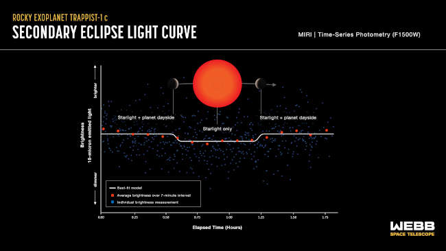
To address these questions, the team used MIRI (Webb’s Mid-Infrared Instrument) to observe the TRAPPIST-1 system on four separate occasions as the planet moved behind the star, a phenomenon known as a secondary eclipse. By comparing the brightness when the planet is behind the star (starlight only) to the brightness when the planet is beside the star (light from the star and planet combined) the team was able to calculate the amount of mid-infrared light with wavelengths of 15 microns given off by the dayside of the planet.
This method is the same as that used by another research team to determine that TRAPPIST-1 b, the innermost planet in the system, is probably devoid of any atmosphere.
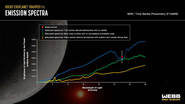
The amount of mid-infrared light emitted by a planet is directly related to its temperature, which is in turn influenced by atmosphere. Carbon dioxide gas preferentially absorbs 15-micron light, making the planet appear dimmer at that wavelength. However, clouds can reflect light, making the planet appear brighter and masking the presence of carbon dioxide.
In addition, a substantial atmosphere of any composition will redistribute heat from the dayside to the nightside, causing the dayside temperature to be lower than it would be without an atmosphere. (Because TRAPPIST-1 c orbits so close to its star – about 1/50th the distance between Venus and the Sun – it is thought to be tidally locked, with one side in perpetual daylight and the other in endless darkness.)
Although these initial measurements do not provide definitive information about the nature of TRAPPIST-1 c, they do help narrow down the likely possibilities. “Our results are consistent with the planet being a bare rock with no atmosphere, or the planet having a really thin CO2 atmosphere (thinner than on Earth or even Mars) with no clouds,” said Zieba. “If the planet had a thick CO2 atmosphere, we would have observed a really shallow secondary eclipse, or none at all. This is because the CO2 would be absorbing all of the 15-micron light, so we wouldn’t detect any coming from the planet.”
The data also shows that it is unlikely the planet is a true Venus analog with a thick CO2 atmosphere and sulfuric acid clouds.
This light curve shows the change in brightness of the TRAPPIST-1 system as the second planet, TRAPPIST-1 c, moves behind the star. This phenomenon is known as a secondary eclipse. Astronomers used Webb’s Mid-Infrared Instrument (MIRI) to measure the brightness of mid-infrared light. When the planet is beside the star, the light emitted by both the star and the dayside of the planet reach the telescope, and the system appears brighter. When the planet is behind the star, the light emitted by the planet is blocked and only the starlight reaches the telescope, causing the apparent brightness to decrease. Credits: NASA, ESA, CSA, Joseph Olmsted (STScI). The absence of a thick atmosphere suggests that the planet may have formed with relatively little water. If the cooler, more temperate TRAPPIST-1 planets formed under similar conditions, they too may have started with little of the water and other components necessary to make a planet habitable.
The sensitivity required to distinguish between various atmospheric scenarios on such a small planet so far away is truly remarkable. The decrease in brightness that Webb detected during the secondary eclipse was just 0.04 percent: equivalent to looking at a display of 10,000 tiny light bulbs and noticing that just four have gone out.
“It is extraordinary that we can measure this,” said Kreidberg. “There have been questions for decades now about whether rocky planets can keep atmospheres. Webb’s ability really brings us into a regime where we can start to compare exoplanet systems to our solar system in a way that we never have before.”
This research was conducted as part of Webb’s General Observers (GO) program 2304, which is one of eight programs from Webb’s first year of science designed to help fully characterize the TRAPPIST-1 system. This coming year, researchers will conduct a follow-up investigation to observe the full orbits of TRAPPIST-1 b and TRAPPIST-1 c. This will make it possible to see how the temperatures change from the day to the nightsides of the two planets and will provide further constraints on whether they have atmospheres or not.
The James Webb Space Telescope is the world's premier space science observatory. Webb will solve mysteries in our solar system, look beyond to distant worlds around other stars, and probe the mysterious structures and origins of our universe and our place in it. Webb is an international program led by NASA with its partners, ESA (European Space Agency), and CSA (Canadian Space Agency). MIRI was contributed by NASA and ESA, with the instrument designed and built by a consortium of nationally funded European Institutes (the MIRI European Consortium) and NASA’s Jet Propulsion Laboratory, in partnership with the University of Arizona.
This graph compares the measured brightness of TRAPPIST-1 c to simulated brightness data for three different scenarios. The measurement (red diamond) is consistent with a bare rocky surface with no atmosphere (green line) or a very thin carbon dioxide atmosphere with no clouds (blue line). A thick carbon dioxide-rich atmosphere with sulfuric acid clouds, similar to that of Venus (yellow line), is unlikely. Credits: NASA, ESA, CSA, Joseph Olmsted (STScI).
LAKE COUNTY, Calif. — The company that provides the community evacuation interface for zone mapping of Lake County is changing its name over the objections of law enforcement agencies.
Zonehaven AWARE is changing its name to Genasys Protect, effective June 27.
For the last several years, the Lake County Sheriff’s Office has used Zonehaven to map evacuation zones across Lake County, which typically are used during fire emergencies.
The name change has raised concerns about confusion for the public.
Lauren Berlinn, the sheriff’s office’s community outreach officer, told Lake County News that the agency — and multiple other law enforcement and fire agencies — fought the name change “at every turn.”
“However,” she added, “the corporate decision makers went ahead with the rebrand.”
Berlinn said she has woven the name change into her fire season social media campaign, which kicked off this week.
In a letter to the sheriff’s office that Berlinn shared with Lake County News, Richard S. Danforth, chief executive officer of Genasys Inc., said, regarding what has changed with the name conversation, “We’re now able to better assist you and your organization in using data to optimize how you protect and inform your community — before, during, and after a critical event. We’re also able to help you better tell the Genasys story to your stakeholders, including the media, as you increase awareness and build support for your initiatives.”
Regarding what hasn’t changed, Danforth said the company will still provide the same level of support and transparency, and reliable products.
For more about the service and what your zone is during an emergency, visit the Lake County Sheriff’s Office website here.
Richard Handler, University of Virginia and Laura Goldblatt, University of Virginia
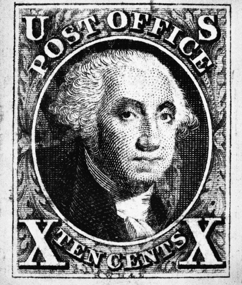
With the ascension of King Charles III to the British throne, some commentators have made much of the fact that the new stamp bearing his image features the king without a crown.
This is a major break with a tradition that began in 1840 with the world’s first postage stamp, the Penny Black, which featured the reigning monarch, Queen Victoria, wearing her crown.
Less discussed is the fact that the living monarch’s image must appear on all British stamps because the monarch embodies the nation itself. This is true even for commemorative stamps that honor historically important persons and events. Whether sharing equal billing with another person or relegated to a corner, the living monarch’s image will always be found on British stamps.
As we discuss in our recent book, “The American Stamp,” when the United States was ready to release its first stamps in 1847, the Post Office returned to the issues that had first been raised in a debate about coins. In 1792, when the U.S. mint was founded, a proposal to feature the heads of living presidents on the nation’s coinage was defeated in Congress by those who argued that to do so would be monarchical. In a republic, they proclaimed, only history, not heredity, could determine who was worthy of lending their likeness to the nation’s money.
It was agreed that only dead or allegorical persons – for example, the Goddess of Liberty – can be depicted on U.S. currencies. The postal service adopted similarly democratic ideals.
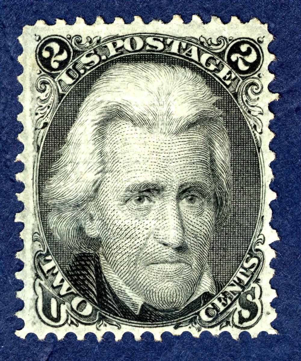
The questions of the day became “Who deserves to be honored on American stamps?” or “What does democracy look like?” The Post Office answered, “like dead heroes” – or, more specifically, like images of deceased white males whom history deemed central to the nation’s founding and growth. The country’s first stamp designs featured Benjamin Franklin and George Washington, who had died in the previous century.
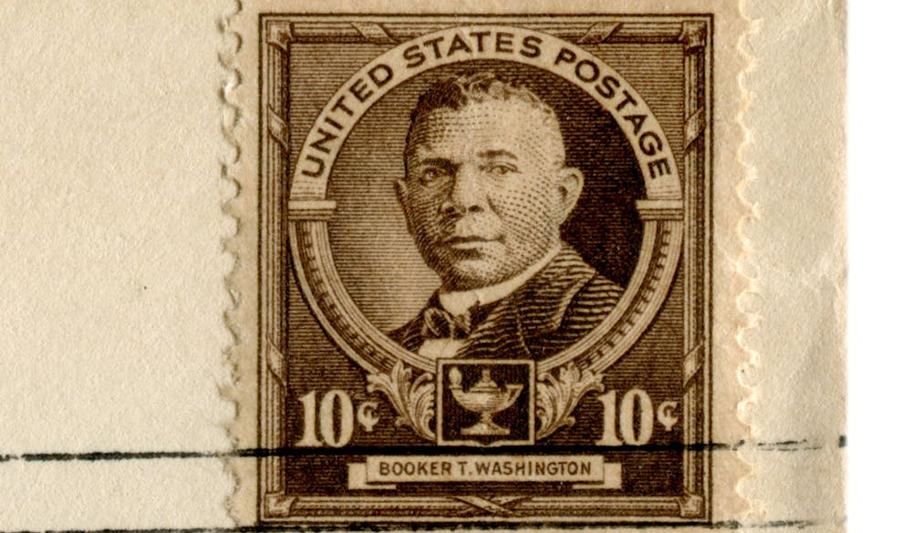
Over the 176 years since that decision was made, American stamps have come to include more and more kinds of people. Indeed, stamps provide a visual history of American thinking about gender and race in a widely disseminated and easily recognizable tiny form.
That tradition continued for both currency and stamps until 1866, when it became
Why did depicting only the dead on U.S. currencies became a national priority in the year after the end of the Civil War? The answer emerged from : Had living persons been allowed to appear on U.S. coins, stamps and banknotes, it would have been possible to depict U.S. citizens who would go on to become traitors to the nation.
This law has held fast, even as stamps have quickly evolved.
In all these cases, history, not heredity, determined who appeared. The only figures guaranteed a stamp are presidents, who become eligible for this honor one year after their death. The idea remains, though, that unlike King Charles III, they did not ascend to the office of president, but earned it due to their contribution to the democratic ideals of the United States.
The politics of representation
Despite these clear ideals, the question of representation has dogged postal portraits. So it is no surprise that when the Post Office established the Citizen’s Stamp Advisory Committee in 1957 to make recommendations to the postmaster general about future designs for stamps, it decreed that its deliberations be kept secret.
Nonetheless, the current diversity of the cast of characters appearing on U.S. stamps continues to generate criticism. People with pronounced political views of whatever stripe can be unhappy with choices that seem to represent their opponents.
A different critique we develop in our book is that apolitical diversity allows the Postal Service to abdicate the responsibility of illustrating what democracy should look like. If you do not pick a side, we argue, then how can citizens know which behaviors or positions are undemocratic?
Indeed, the pitfalls of the good-people-on-both-sides approach was strikingly illustrated in a 1995 pane of 20 stamps commemorating the Civil War, which included both Abraham Lincoln, the president of the Union, and Jefferson Davis, the president of the Confederacy. Surely the legislators who in 1866 decried the possibility of traitors being featured on federal currencies would be baffled by the choice of Davis.
Which raises a problem: If former President Donald Trump is convicted of violating national security laws and obstructing justice, which principle should prevail: that all presidents be guaranteed a postage stamp? Or that only those persons whom history judges to have been faithful to the nation and its democratic principles can appear on U.S. stamps, coins and bank notes?
It’s too soon to know the answer to these questions. But the controversy over who should represent the United States on stamps and what democracy looks like has been with our nation since 1792.
The new King Charles III stamp entered circulation in the United Kingdom on April 4, 2023.Leon Neal via Getty Images
Dennis Fordham. Courtesy photo. An ongoing trust funded with the assets of a deceased settlor benefits both current and remainder (future) beneficiaries, but at different times and in different ways.
Such a trust restricts what the current (e.g., lifetime) beneficiary receives to ensure that some trust assets remain for the remainder beneficiaries. This is where the dual concepts of “income” and “principal” are relevant.
Consider a trust funded by the assets of a deceased spouse that gives the surviving spouse all the net income for her life and provides for use of the principal, if necessary and at the trustee’s discretion, for the surviving settlor’s, “Health, Education, Maintenance and Support” (aka, “HEMS”).
At the surviving spouse’s death what remains goes to the deceased settlor’s own children. What does that mean and how is it administered?
First, it means that the trustee must categorize the trust’s receipts and expenses between the dual concepts of “income” and “principal” to know what the surviving spouse mandatorily receives as income.
What is “income” and “principal” is established under the trust’s own terms (definitions) and, otherwise by the California’s statutory rules in the Uniform Principal and Income Act (UPIA) in Probate Code sections 16320 - 13375.
What receipts (additions to the trust) are income and principal vary by the type of asset from which a receipt is received by the trustee.
For example, under the UPIA distributions from a retirement plan (e.g., an Individual Retirement Plan or a 401(k)) are allocated ten percent (10%) to income and ninety percent (90%) to principal. This treatment of retirement receipts is often a shock to someone who expected all of the retirement plan receipts to be income.
Receipts of interest and dividends are allocated entirely to income. Receipts of capital gain (proceeds from the sale of appreciated assets) are generally allocated entirely to principal as the profit is an increase in asset value.
Again the foregoing UPIA statutory rules only apply to the extent that the trust itself is silent. The trust may have different rules which apply. Moreover, the trustee must also allocate disbursements (expenses) between income and principal; first as provided under the terms of the trust and otherwise under UPIA. Allocation of disbursements vary by the type.
For example, under UPIA trustee fees and other expenses of trust administration are allocated fifty percent to income and fifty percent to principal.
Naturally tension may develop between the current beneficiary and the remainder beneficiary over whether the trustee invests assets primarily to generate interest and dividends, which are income, or to grow in value, which is principal.
Unless the trust gives the trustee discretion to favor one beneficiary over another, a trustee must administer a trust impartially. That means the trustee when investing assets and when allocating receipts and expenses between income and principal must follow the rules in the trust and the code.
Nonetheless, the UPIA allows the trustee, in certain limited situations, to make adjustments between principal and income if certain conditions are satisfied (section 16336 Probate Code).
Furthermore, a trustee may sometimes be able to eliminate the complexities and tensions associated with administering a “net income” trust by converting the trust to a much more manageable Unitrust.
With a unitrust, the net income beneficiary receives a certain percentage of the trust’s average year end value as determined for the prior three years. The unitrust distribution percentage is from 3 to 5%.
A unitrust approach may be drafted into the settlor’s trust while the settlor is still alive as part of the estate planning, in which case the unitrust applies from the very start of administering the trust after the settlor’s death.
The foregoing is a brief discussion of the trust principal and income concepts. For legal guidance regarding beneficial rights and trustee duties consult a qualified attorney.
Dennis A. Fordham, attorney, is a State Bar-Certified Specialist in estate planning, probate and trust law. His office is at 870 S. Main St., Lakeport, Calif. He can be reached at Dennis@DennisFordhamLaw.com and 707-263-3235.
View of Mars in UV light, colorized; a bright white ice cap shines at the bottom of the frame, with other cratered surface features appearing dull, hazy brown and blue. Credits: NASA/LASP/CU Boulder.
NASA’s MAVEN (Mars Atmosphere and Volatile EvolutioN) mission acquired stunning views of Mars in two ultraviolet images taken at different points along our neighboring planet’s orbit around the Sun.
By viewing the planet in ultraviolet wavelengths, scientists can gain insight into the Martian atmosphere and view surface features in remarkable ways.
MAVEN’s Imaging Ultraviolet Spectrograph (IUVS) instrument obtained these global views of Mars in 2022 and 2023 when the planet was near opposite ends of its elliptical orbit.
The IUVS instrument measures wavelengths between 110 and 340 nanometers, outside the visible spectrum.
To make these wavelengths visible to the human eye and easier to interpret, the images are rendered with the varying brightness levels of three ultraviolet wavelength ranges represented as red, green, and blue.
In this color scheme, atmospheric ozone appears purple, while clouds and hazes appear white or blue. The surface can appear tan or green, depending on how the images have been optimized to increase contrast and show detail.
The first image was taken in July 2022 during the southern hemisphere’s summer season, which occurs when Mars passes close to the Sun.
The summer season is caused by the tilt of the planet’s rotational axis, similar to seasons on Earth. Argyre Basin, one of Mars’ deepest craters, appears at bottom left filled with atmospheric haze (depicted as pale pink).
The deep canyons of Valles Marineris appear at top left filled with clouds (colored tan in this image).
The southern polar ice cap is visible at bottom in white, shrinking from the relative warmth of summer. Southern summer warming and dust storms drive water vapor to very high altitudes, explaining MAVEN’s discovery of enhanced hydrogen loss from Mars at this time of year.
The second image is of Mars’ northern hemisphere and was taken in January 2023 after Mars had passed the farthest point in its orbit from the Sun. The rapidly changing seasons in the north polar region cause an abundance of white clouds. The deep canyons of Valles Marineris can be seen in tan at lower left, along with many craters. Ozone, which appears magenta in this UV view, has built up during the northern winter’s chilly polar nights. It is then destroyed in northern spring by chemical reactions with water vapor, which is restricted to low altitudes of the atmosphere at this time of year.
MAVEN launched in November 2013 and entered Mars’ orbit in September 2014. The mission’s goal is to explore the planet’s upper atmosphere, ionosphere, and interactions with the Sun and solar wind to explore the loss of the Martian atmosphere to space.
Understanding atmospheric loss gives scientists insight into the history of Mars' atmosphere and climate, liquid water, and planetary habitability. The MAVEN team is preparing to celebrate the spacecraft’s 10th year at Mars in September 2024.
MAVEN’s principal investigator is based at the University of California, Berkeley, while NASA’s Goddard Space Flight Center in Greenbelt, Maryland, manages the MAVEN mission. Lockheed Martin Space built the spacecraft and is responsible for mission operations.
NASA’s Jet Propulsion Laboratory in Southern California provides navigation and Deep Space Network support. The Laboratory for Atmospheric and Space Physics at the University of Colorado Boulder is responsible for managing science operations and public outreach and communications.
Willow Reed is MAVEN communications lead for the Laboratory for Atmospheric and Space Physics, University of Colorado Boulder.
View of Mars in UV light, colorized; a deep purple hue dominates the top part of the image, with other cratered surface features showing in hazy, muted tones of brown and dark green. Credits: NASA/LASP/CU Boulder.
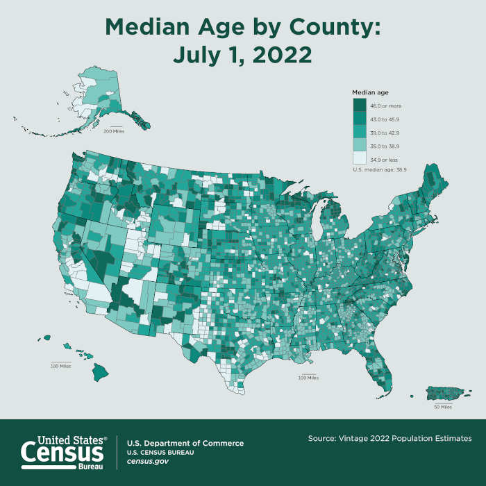
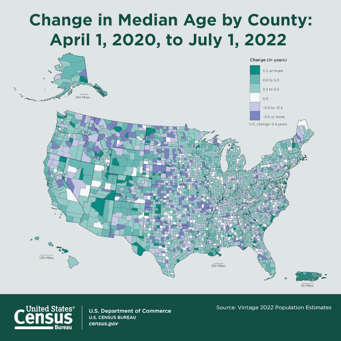
The nation’s median age increased by 0.2 years to 38.9 years between 2021 and 2022, according to Vintage 2022 Population Estimates released this week by the U.S. Census Bureau.
Median age is the age at which half of the population is older and half of the population is younger.
“As the nation’s median age creeps closer to 40, you can really see how the aging of baby boomers, and now their children — sometimes called echo boomers — is impacting the median age. The eldest of the echo boomers have started to reach or exceed the nation’s median age of 38.9,” said Kristie Wilder, a demographer in the Census Bureau’s Population Division. "While natural change nationally has been positive, as there have been more births than deaths, birth rates have gradually declined over the past two decades. Without a rapidly growing young population, the U.S. median age will likely continue its slow but steady rise.”
Lake County was one of five counties in California to show a decrease of 0.5% or more in median age.
The latest data showed that Lake County’s median age range from 39 to 42.9 years.
A third (17) of the states in the country had a median age above 40.0 in 2022, led by Maine with the highest at 44.8, and New Hampshire at 43.3. Utah (31.9), the District of Columbia (34.8), and Texas (35.5) had the lowest median ages in the nation. Hawaii had the largest increase in median age among states, up 0.4 years to 40.7.
No states experienced a decrease in median age. Four states — Alabama (39.4), Maine (44.8), Tennessee (39.1), West Virginia (42.8), and the District of Columbia (34.8) — had no change in their median age from 2021 to 2022.
The median age of the nation’s 3,144 counties or equivalents ranged from 20.9 to 68.1 in 2022. About 75% (2,357) had a median age at or above that of the nation, down from 76% and 2,374 counties in 2021.
Roughly a quarter (787) had a median age below the national median age in 2022, 17 more than in 2021 when 770 counties had median ages under the then 38.7 national median age. Fifty-nine percent (1,846) of U.S. counties experienced an increase in median age between 2021 and 2022, up from 51% or 1,590 counties between 2020 and 2021.
Race and ethnicity facts
The new Census data release included pdated estimates by race and Hispanic origin.
Statistics of particular note include the following.
The White population in the United States was 260,570,291 in 2022, representing an increase of 0.1% or 388,779 people from 2021.
In 2022, California had the largest White population (29,079,926), followed by Texas (23,853,626) and Florida (17,553,268). Florida also had the largest-gaining (321,037) and second fastest-growing (1.9%) White population behind South Carolina, which grew by 2.0% (74,990).
Comprising 15% of the nation’s total population in 2022, the national Black population totaled 50,087,750, up 0.9% from July 2021.
Texas had the largest Black population in 2022, with a total of 4,334,313, an increase of 120,945 (2.9%) from July 2021. Maine had the fastest-growing Black population, expanding by 7.0% (2,412 people) between 2021 and 2022.
The Asian population in the United States was 24,683,008 in 2022, up 577,420 or 2.4% from 2021.
In 2022, California had the largest Asian population (7,242,739), followed by New York (2,085,285) and Texas (1,958,128). California also had the largest-gaining Asian population with an increase of 108,881, while Montana — with an increase of 6.8% (1,276) — had the fastest-growing Asian population.
California was home to four of the top five counties with the largest Asian populations in 2022. Los Angeles County topped the list with an Asian population of 1,711,002, followed by Santa Clara County (830,790) and Orange County (816,274). Alameda County, California, had the fifth largest Asian population at just over 616,000, and Queens County, New York, ranked fourth with an Asian population of 671,358.
The American Indian and Alaska Native population reached 7,274,656 between July 2021 and July 2022, an increase of 93,443 or 1.3%. California had the largest American Indian and Alaska Native population at 1,114,580, followed by Oklahoma (572,435) and Texas (528,255). Texas also had the largest-gaining American Indian and Alaska Native population, having increased by 15,245 from 2021 to 2022, while the District of Columbia had the nation’s fastest-growing American Indian and Alaska Native population, increasing by 5.0% or 507 residents.
The Native Hawaiian and Other Pacific Islander population rose to 1,759,756, an increase of 1.8% or 31,949 people in 2022.
Hawaii had the largest Native Hawaiian and Other Pacific Islander population (393,837), followed by California (373,173) and Washington (109,115).
The Hispanic population gained over a million residents, reaching 63,664,346 in 2022, an increase of 1.7%.
Among states, California (15,732,180), Texas (12,068,549), and Florida (6,025,030) had the largest Hispanic population, while New York (3,867,076) was the only state to experience a drop (-0.7%, -27,522) in the Hispanic population.
SELECT `id`,`rules`
FROM `lcnews_viewlevels`64μs1.73KB/libraries/src/Access/Access.php:955Copy
SELECT `b`.`id`
FROM `lcnews_usergroups` AS `a`
LEFTJOIN `lcnews_usergroups` AS `b` ON `b`.`lft` <= `a`.`lft` AND `b`.`rgt` >= `a`.`rgt`
WHERE `a`.`id` = :guest69μs1.64KBParams/libraries/src/Access/Access.php:868Copy
SELECT `template`
FROM `lcnews_template_styles`
WHERE `client_id` =0AND `home` =172μs872B/plugins/system/helix3/helix3.php:247Copy
select `blacklist` from lcnews_ad_agency_settings393μs872B/modules/mod_ijoomla_adagency_zone/helper.php:2043Copy
select `params` from lcnews_ad_agency_settings61μs2.1KB/modules/mod_ijoomla_adagency_zone/helper.php:74Copy
SELECT*FROM lcnews_ad_agency_zone WHERE zoneid=203 LIMIT 189μs4.69KB/modules/mod_ijoomla_adagency_zone/helper.php:104Copy
select `approved` from lcnews_ad_agency_banners where `id`=061μs840B/modules/mod_ijoomla_adagency_zone/helper.php:121Copy
select `approved` from lcnews_ad_agency_banners where `id`=0220μs0B/modules/mod_ijoomla_adagency_zone/helper.php:122Copy
deletefrom lcnews_ad_agency_ips where `entry_date` <='2025-05-15'198μs0B/modules/mod_ijoomla_adagency_zone/tmpl/default.php:16Copy
SELECT*FROM lcnews_ad_agency_zone WHERE zoneid=203 LIMIT 1948μs4.69KB/modules/mod_ijoomla_adagency_zone/tmpl/default.php:20Copy
select `params` from lcnews_ad_agency_settings58μs872B/modules/mod_ijoomla_adagency_zone/tmpl/default.php:48Copy
SELECTSUM(CASEWHEN `a`.`next_execution` <= :now THEN1ELSE0END) AS due_count,SUM(CASEWHEN `a`.`locked` ISNULLTHEN0ELSE1END) AS locked_count
FROM `lcnews_scheduler_tasks` AS `a`
WHERE `a`.`state` =1166μs1.71KBParams/administrator/components/com_scheduler/src/Model/TasksModel.php:517Copy
SELECT `session_id`
FROM `lcnews_session`
WHERE `session_id` = ?323μs1.64KBParams/libraries/vendor/joomla/session/src/Handler/DatabaseHandler.php:291Copy
UPDATE `lcnews_session`
SET `data` = ?
	, `time` = ?
WHERE `session_id` = ?992μs912BParams/libraries/vendor/joomla/session/src/Handler/DatabaseHandler.php:318Copy

 How to resolve AdBlock issue?